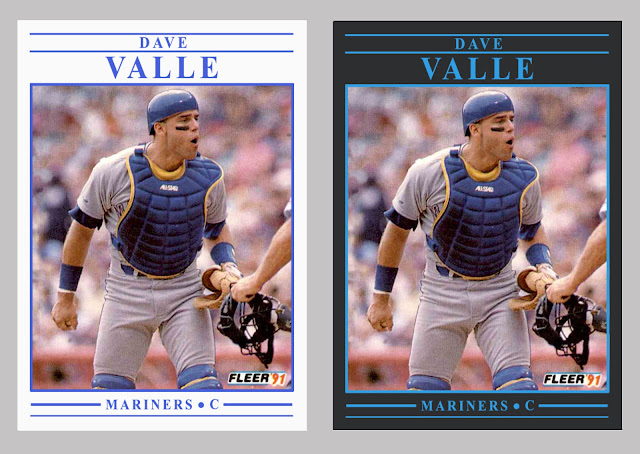
A couple of months ago, I posted a preliminary redesign of what was originally a very yellow 1991 Fleer baseball card set. I say preliminary because by the end of that post I just couldn't decide which of two border color ideas I liked better: white or charcoal. So, I asked you, the readers, to contribute your thoughts.
The comments were just about even between white and charcoal, so instead of choosing one border color or the other for the complete redesign, I figured I'd do both for each team. Bonus cards!
Just as with the 1992 Fleer redesign I did a while back, I tried to choose a card for each team that featured a well-framed shot, a good action shot, or otherwise interesting subject matter. As you'll see, I think the Fleer photographers captured some gems that season.
First, here's a reminder of what the original cards look like. Jack Clark is wondering why so much yellow.
Now here's the redesign for each team, in alphabetical order by city name.
I think I like some of the teams better in white (Brewers, Yankees, Phillies) and other teams in charcoal (Orioles, Athletics, Pirates). And then there are some teams that look fine either way (Pirates, Cardinals, Blue Jays). Ultimately, I enjoyed the project, and I hope you like the way the cards turned out.
Any favorites of the bunch? Did I do your team justice with the color and image choice?
Share in the comment section, and thanks for reading.


0 Yorumlar